
Faisal Hossain
Chittagong University of Engineering and Technology
Bangladesh
Architecture
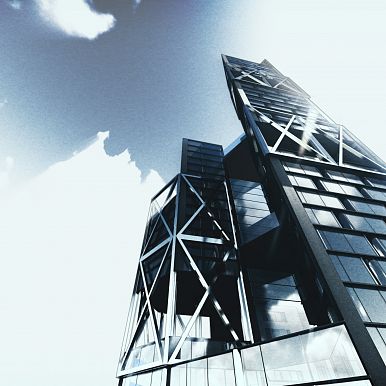
Vertical Research HUB
RESEARCH: The systematic investigation into and study of materials and sources in order to establish facts, then "expands" the research in the form of discussion and results. If the building is considered as a "vertical research", the idea is to express its form in those expansions.

Feedback A
The image is very uniform, uninteresting in color. The dramatic sky disappears in the context of the same color of the surrounding buildings and the main design. However, the main idea of the picture, as I perceive it, to show a dramatic transition and highlight the main building, is great. I would prefer to divide the image into two parts. I would make the right part with the main design more contrasting, brighter, sharper. The sky could turn brighter in this part. The left part could remain as it is. In my opinion, this would emphasize the importance of the building.

Feedback B
Red - in the picture, the main elements should never be completely at the edge. Think of it as if you were printing a photo on a stereo printer. It may happen that the printer takes a piece of the edge and you lose the design. Visually, it affects the observer in exactly the same way.
Blue - The sky is not completely realistic, it would be better to replace it with some sky from real skies.

Feedback C
Perfect presentation of the model, I would easily combine it with visualization. Need to add small characters, cars, etc.


